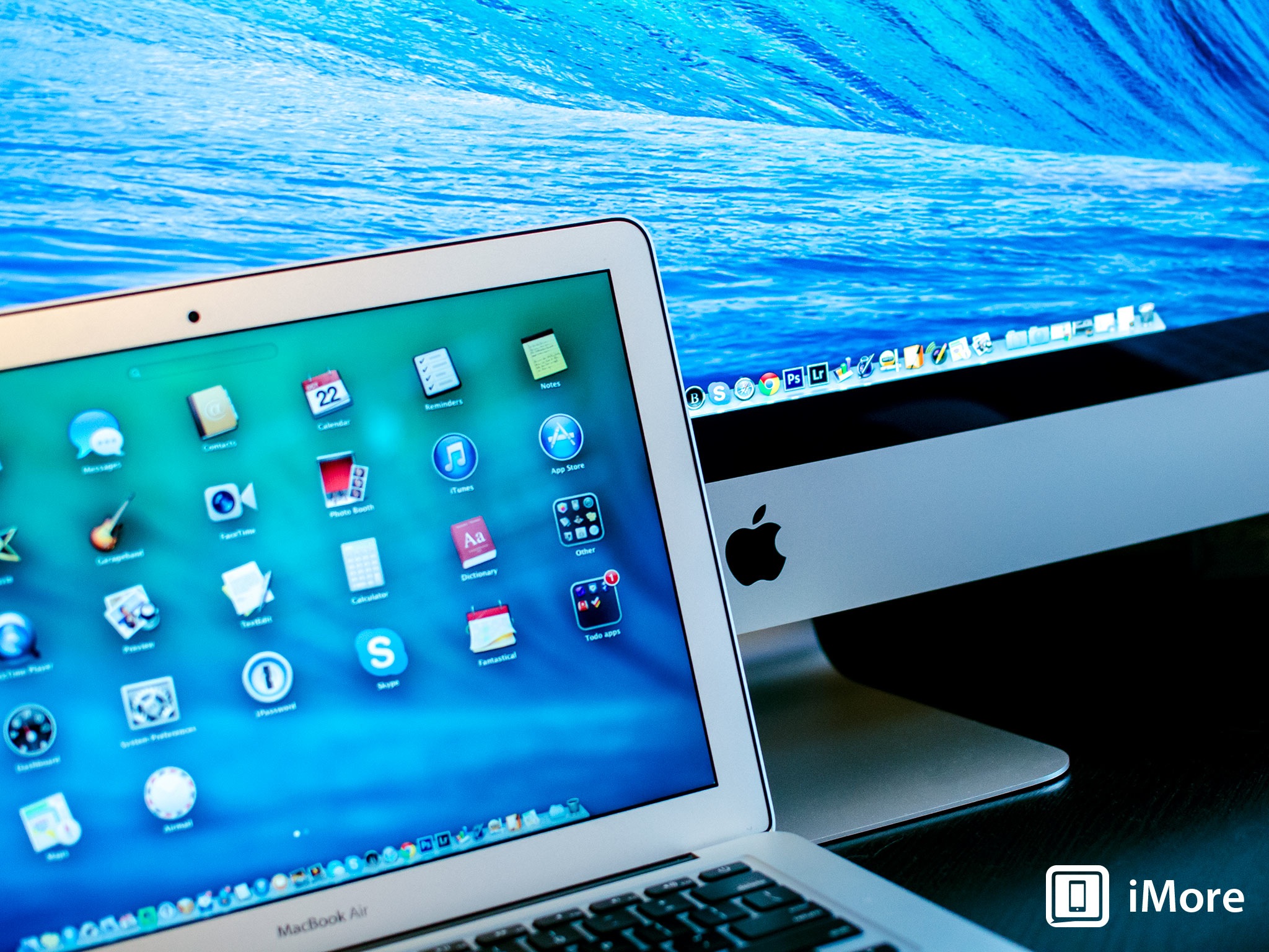
Top to bottom review of Apple's newest Mac operating system, OS X Mavericks
Over the course of the past decade, we've seen many changes to OS X - some iterative, some significant. OS X's newest incarnation, "Mavericks" or version 10.9, is a bit of both. It doesn't significantly rework the user interface like Apple did with iOS 7, though there are some nice tweaks. Apple did make a number of changes under the hood to improve performance and efficiency, however, especially for mobile users.
Note: Some of this material was originally published in our Mavericks preview but was incomplete and outdated due to Apple's non-disclosure agreement (NDA). It's been fully updated, expanded upon, and refined here into our full on OS X review. Enjoy!
OS X evolution

It's been a long road to get here. Mac OS X was first introduced as a public beta in 2001, and beta it was - a radical departure from Mac OS 9, both in look (introducing the "Aqua" interface) and in operation. Mac OS X was built on a UNIX foundation, and was more closely related to the NextStep operating system that had been developed by NeXT, the computing company Steve Jobs founded between stints running Apple.
Over the years Apple has iteratively improved OS X, typically waiting until a major release before introducing major new features, capabilities and applications. Early on Apple cranked out changes to OS X on an annual basis, but once the company hit Mac OS X 10.3 "Panther," it slowed down, changing to a biannual upgrade cycle.
Apple wasn't standing still between those upgrades, either. By 2005 the PowerPC chip that had served as the basis for Macs throughout the 90s was pushing its limits. Fortunately, hedged its bets, and had been working to keep OS X operating on Intel hardware as well. And so Apple was able to migrate successfully to a different microprocessor architecture without having to start over at square one.
Since then Apple's stayed the course, and with the introduction of Mountain Lion in 10.8, made it clear that it was resuming its annual upgrade cycle again, to iterative make changes to the operating system to keep up with new technology and user expectations. And that brings us to today and the launch of OS X 10.9 "Mavericks," the first installment of the operating system not to carry a big cat's name.
To that end, Apple has run out of big cats to name their operating system. So starting with Mavericks, they've switched to a nomenclature based on places in California, Apple's home state - places that Apple says its employees draw their inspiration from.
Mavericks is actually a surfing spot in Northern California, not too far from Half Moon Bay. That's a local spot for Apple employees, to be sure - it's in San Mateo County, only about 30 miles from Apple's corporate headquarters.
Compatibility and updating

OS X Mavericks comes pre-installed on the new Macs introduced on Tuesday's Apple Event. It's also available as a downloadable update for free from the Mac App Store.
Mavericks works on any 64-bit capable Mac. Supported models include:
- iMac (Mid-2007 or later)
- MacBook (13-inch Aluminum, Late 2008), (13-inch, Early 2009 or later)
- MacBook Pro (13-inch, Mid-2009 or later), (15-inch, Mid/Late 2007 or later), (17-inch, Late 2007 or later)
- MacBook Air (Late 2008 or later)
- Mac Mini (Early 2009 or later)
- Mac Pro (Early 2008 or later)
- Xserve (Early 2009)
Installing Mavericks will require a Mac running OS X Snow Leopard 10.6.7 or later with the Mac App Store installed. You don't need to have Lion or Mountain Lion installed to upgrade.
OS X Mavericks interface updates make an easy, productive transition
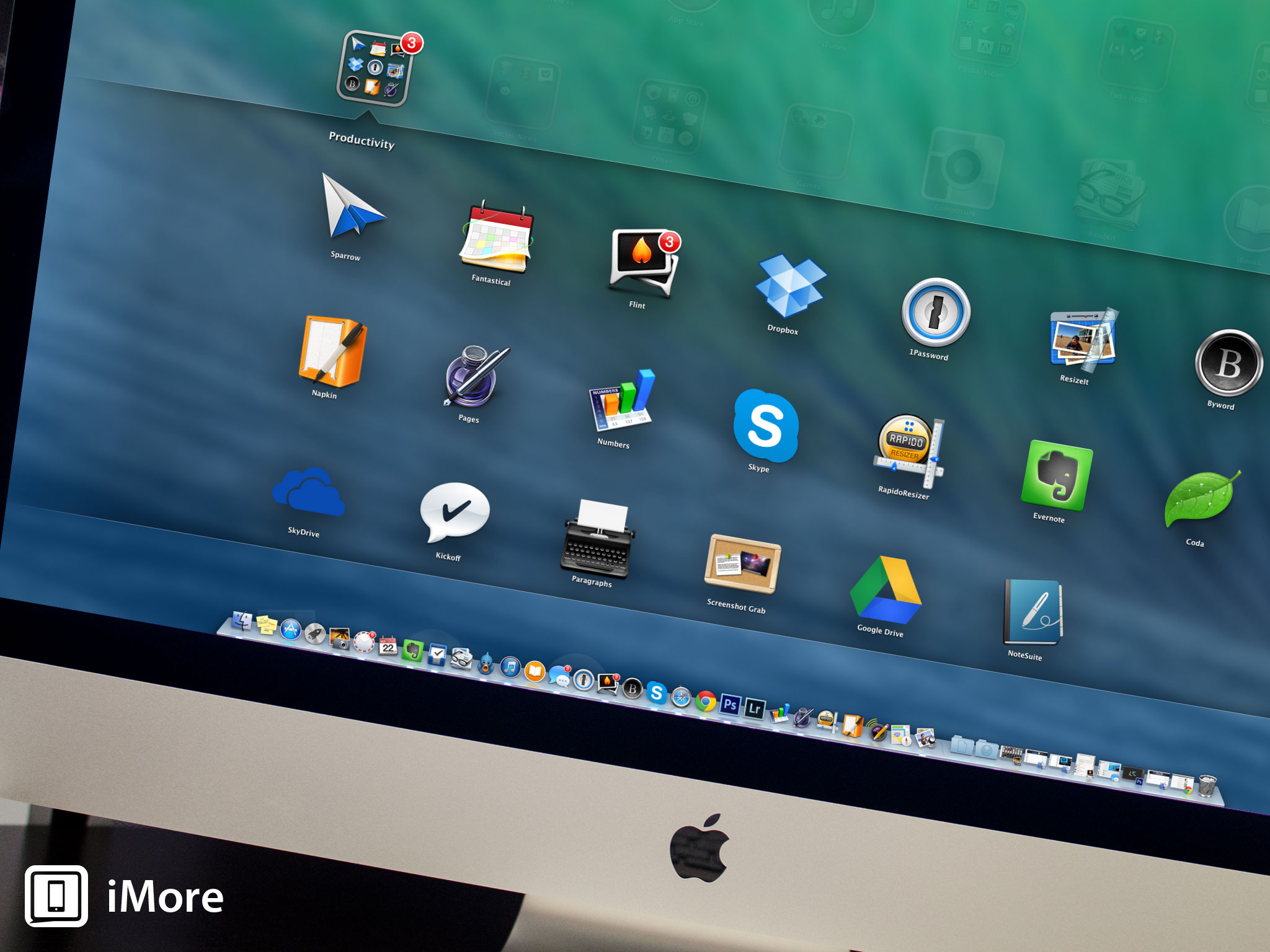
Tabbed Web browsing has been a staple of Safari for a number of years - instead of cluttering up your desktop with more windows, hit Command-T to create a tab, instead. It's neatly consolidated inside your existing Safari window but gives you an entirely separate Web page to work from. When you're multitasking or if you need to compare information on different pages, tabbed web pages are a great time saver.
The same basic concept has been employed for Finder Tabs. Instead of creating multiple windows to clutter your desktop, everything stays in one window instead. You can create different Finder Tabs to keep track of anything you'd use a Finder window for - documents or specific folders you're using, AirDrop, the Desktop and more.
In fairness, Finder tabs have been the domain of third-party utilities for some time, but that requires that users install a separate program to enable the capability. This brings that feature to the masses once and for all.
You've been able to assign color labels to Mac files since time immemorial, but tagging is new to Mavericks. It's another big time saver, and it will help you instantly find files and folders you're looking for - not just for local files on your Mac, but for stuff you've stored in iCloud, too.
Tagging lets you attach metadata to your files to make them easier to find - color tags, of course, but also specific keywords that will help you locate things later. You can use descriptive words - "home," "work," "important," "contract" - whatever you might need - then use those tags to find content later. If you lose documents in folders inside of folders nested like Russian matryoshka dolls, this may be a better way for you to find what you need later. What's more, tagging is supported in save dialogues, so you can add tags when you first create files.
OS X Mavericks brings iPad-style iBooks to the Mac - only better
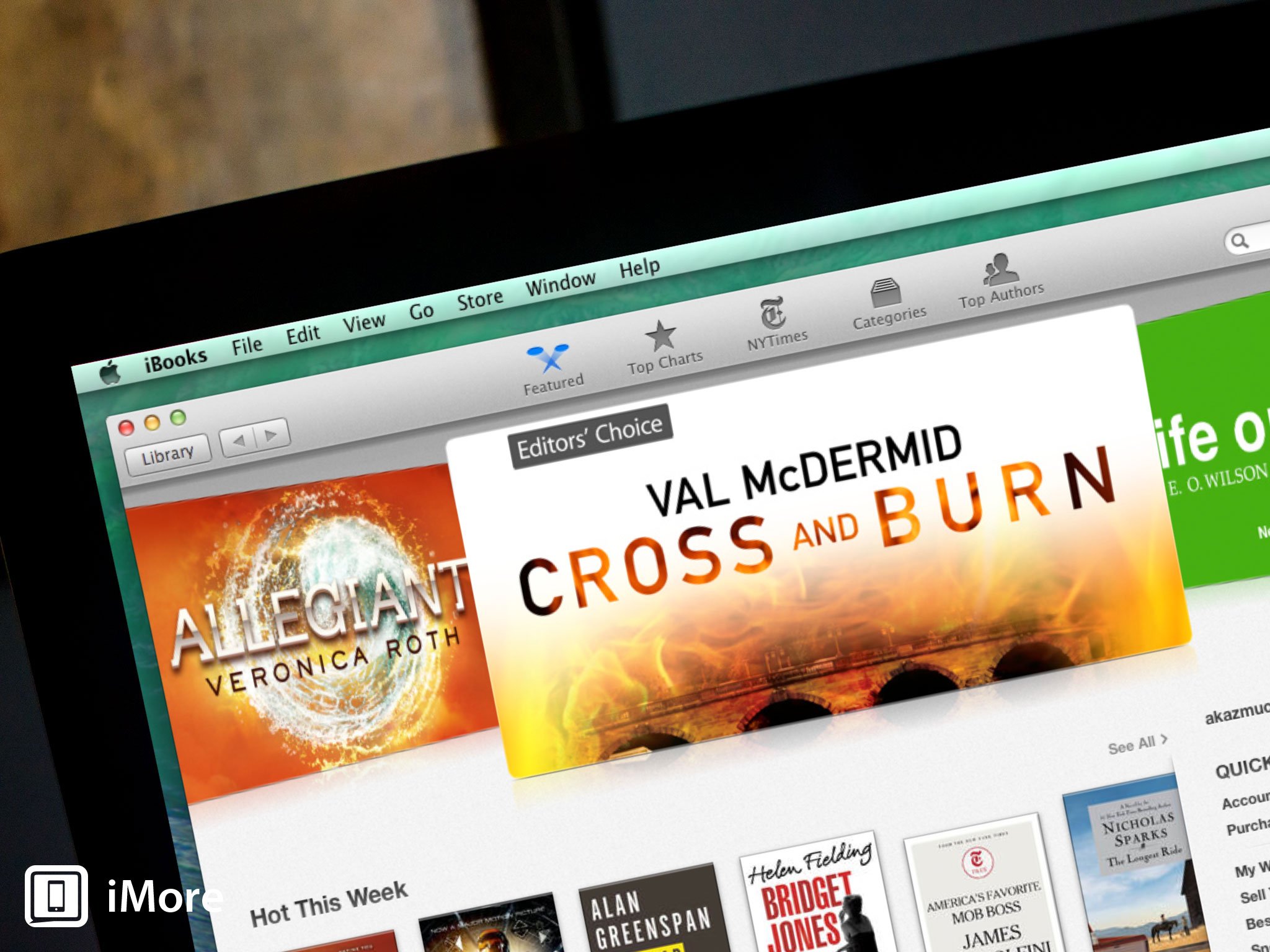
Apple's ebook reader software, iBooks, was first introduced when the iPad debuted in April 2010 and later became available for other iOS devices with iOS 4's release. It's never been essential software - Apple offers it as an optional free download from the App Store rather than including it with every shipping iOS device - but it's an obvious killer app, especially for the iPad.
Now it's come to the Mac, and it's largely unchanged from before. All of the features you're already familiar with from iBooks are present: you can search, you can bookmark pages, adjust font and type size, even switch page color from white to sepia or to night mode, which inverts the color scheme to white type on black pages (less intrusive if you're lying in bed next to someone who's trying to sleep). There's also a scrolling function if you'd prefer not to have to manually flip pages using the mouse, trackpad or keyboard.

You can do things with iBooks on the Mac that you can't on the iPad or iPhone, however. You can have multiple books open simultaneously, for example. Need to compare or contrast source material from two different textbooks? No problem. Mavericks' iBooks lets you highlight passages and attach notes - a feature you can find in the iOS version too - but rather than burying the notes as popups that run in the margin of the book, a Notes pane that runs along one side of the page. This makes it much easier to refer to notes you've added or attached as parts of highlighted sections.
iBooks in Mavericks syncs with iBooks in iOS, so you'll see the same library selections. And you can import PDFs and ePub books, too.
OS X Mavericks Maps help you - and other apps - find your way

Maps in Mavericks looks and acts very much like its iOS counterpart. In fact, it uses the same datasets. The difference is in the size of the screen you're looking at it on, the speed of the network you're downloading data from (Wi-Fi, versus whatever your cell service provider has available), and the rendering power of the computer behind it.
The three of those things combined make Maps on Mavericks a real pleasure to use. When you zoom in to an area, it very quickly renders and populates with points of interest, and it's lightning-fast to respond to search queries too.
Opening the Maps application should look instantly familiar to anyone who's used it on iOS. You can pinpoint your location, look at your surrounds in a 2D view, switch to 3D if you prefer, or combine satellite and 3D imagery to use the "Flyover" feature Apple pioneered in iOS 6, where cityscapes are rendered in photo-realistic 3D.
A Search field lets you find specific addresses, but it can be also used to find points of interest. So if you want to locate a restaurant, museum or shop near you, enter whatever info you're looking to search on and Maps will try to locate something nearby.
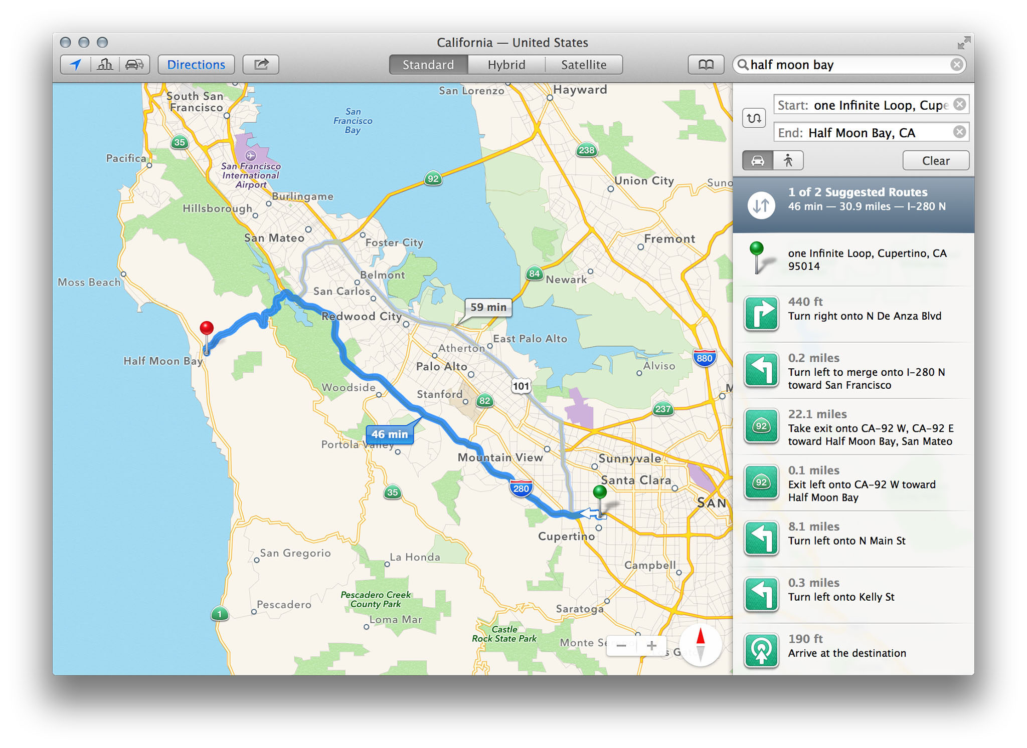
Once you've plotted the location of your destination, You can add it to your Bookmarks list (synced between the maps apps of any other OS X or iOS devices connected through iCloud), get directions or add it to your Contacts database.
Like Maps on iOS, Maps for Mavericks provides point to point directions, and will show you real-time traffic conditions. If traffic's bad, Maps can suggest alternate routes. Once you've got your route plotted out, you can send them in a message, e-mail the information, post it to Twitter or Facebook if you've connected those services, add it to Contacts, bookmark it, or send it to your iPhone.
Maps also introduces some much-welcome support for mapping functions into other applications. Take Calendar, for example: Now when you type in an address for a new appointment, Calendar uses that map data to locate the address, show you a thumbnail map (which opens the Maps app) and can even pad your schedule with travel time.
Maps illustrates a couple of very important points that Apple isn't stating directly but wants to underscore. One is that Maps integrates really well into other Mavericks apps, like Contacts and Calendar. Presumably, there will be other ways to integrate that connectivity into other apps, too, because like iOS Maps, Maps in Mavericks doesn't directly support mass transit travel information.
Secondly, Maps does its best to erase the division between iOS and OS X. You can send map data to your phone, for example. And bookmarking a map in the Maps app will sync that bookmark to the Maps app on any other device, iOS or OS X, connected via iCloud.
Apple's also publishing a Map Kit API for third-party app developers who want to integrate Maps data into their own applications. They've even provided a very handy example of how this works with the reworked Calendar app, which lets you plot travel time and embed directions.
OS X Mavericks debuts a familiar-looking Calendar

While Mavericks doesn't have the top-to-bottom flat interface makeover that iOS got when iOS 7 debuted (one can only imagine the howls of outrage from Mac users if such a thing had happened), there are some improvements to reduce the evidence of "skeuomorphism" in Mavericks app design. Nowhere is this more apparent than in the Mavericks Calendar app, which is very similar to what we see in iOS 7.
The familiar deskpad interface with its torn margin is gone, and it its place is a sleek and simple design that Apple calls "streamlined."
From the top down, the next obvious change is the placement of the navigation buttons and the date - they've been reversed in weekly, monthly, and yearly views, to give you a clearer visual cue to show what time period you're looking at.

Also gone is the one pixel-wide table grid that's used in Mountain Lion's Calendar for Week, Month and Year layouts. Days in Mavericks are instead separated with white space, with a one-pixel border to separate them vertically. The net result is a cleaner, less cluttered look.
Continuous scrolling is a new feature in Mavericks Calendar. In the monthly view, this means that you can scroll vertically from week to week (the current week gets a colored horizontal line across the top to help you return to it quickly; you can also just click the Today button). In Mountain Lion Calendar, you can horizontally scroll, in weekly or daily views. The scrolling in daily mode is abrupt, replacing each day's events as you scroll; weekly will snap to the next week's events. Now it's smoother and more continuous.
The new look and feel of Calendar will be a welcome change for users who are increasingly accustomed to gesture-based controls for all aspects of the OS X interface, but Calendar gets some really functional enhancements, too. The Inspector is where you'll see the greatest changes. Calendar's Inspector now ties into that data to provide you with a small map showing your meeting location. That's only a thumbnail, though, so if you need walking or driving directions, you can click on the image and the Maps app will automatically open and plot the way.
OS X Mavericks lets you connect to your Facebook account, and if you've said yes to events you've learned about through Facebook, they'll be displayed on a separate Facebook Events calendar.
OS X Mavericks Notifications become interactive - do more with less effort
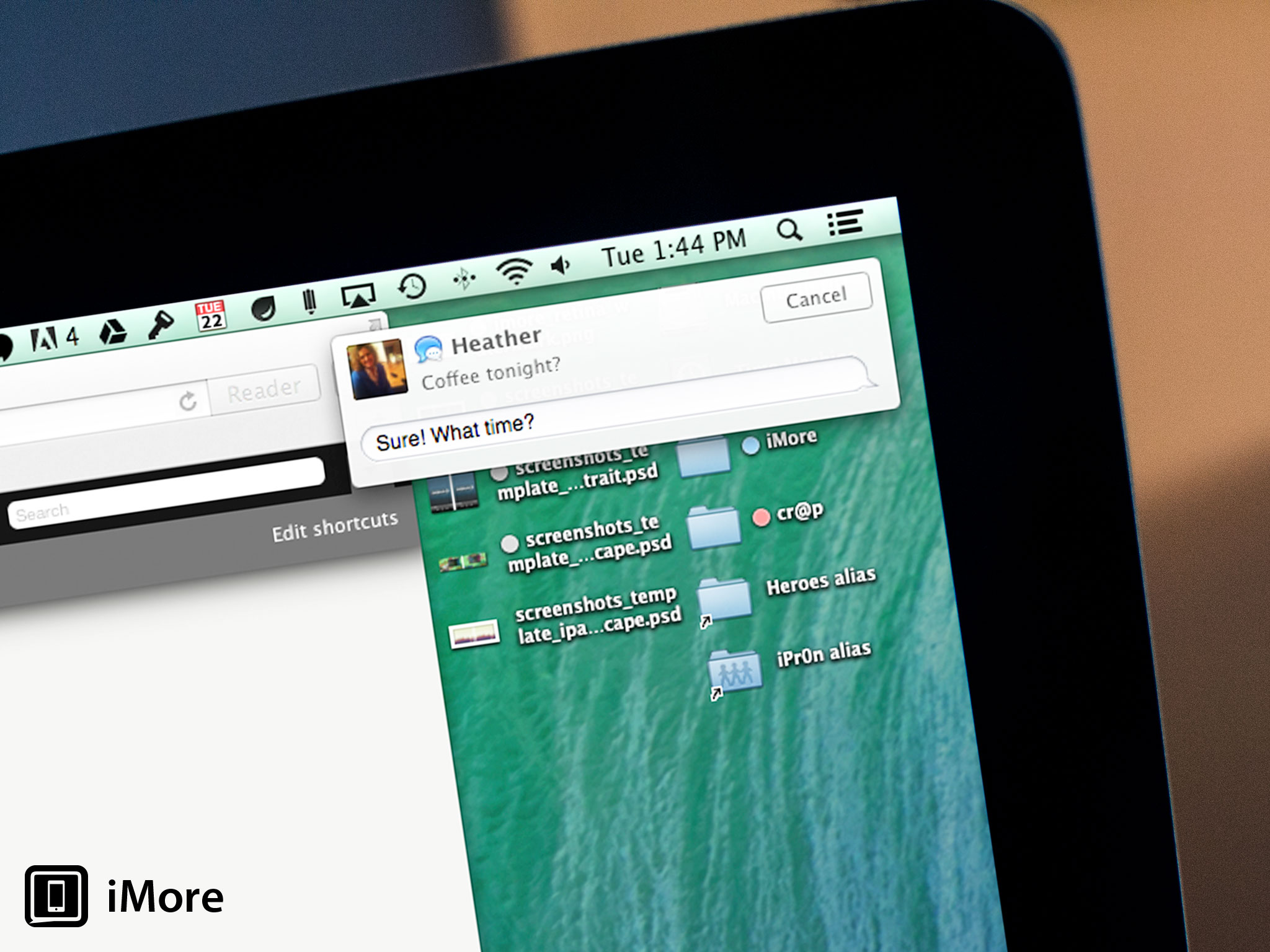
For years, Mac users who wanted to consolidate notifications from various applications had to rely on third-party apps like Growl to get the job done. That changed in 2012 when Apple rolled out Mountain Lion, which incorporated the iOS-like Notification Center for the first time.
But Apple's implementation of system-wide notifications was sorely lacking: while it provides you with regular status updates through pop up windows and collects them all in a sidebar you can view using a trackpad or mouse gesture, Mountain Lion notifications don't provide any sort of interactivity. So when a tweet comes your way you want to respond to, you still have to open your Twitter application and do it yourself.
Mavericks is taking a big step in the right direction by offering one-click interactivity with notifications. Now when a notification pops up from e-mail, Messages or FaceTime, you can respond without breaking stride in whatever you're doing.
Apple's doing more than that, however - they're bridging connectivity between iOS and OS X Mavericks. So if you have an app running on your iPhone, iPod touch or iPad that sends you Push Notifications, you can now get those Push Notifications on the Mac.
Notifications also rounds up your alerts when your Mac is asleep, so when you wake your computer you'll get a list of all notifications that have happened directly from your Lock Screen. If you're concerned about people spying stuff they shouldn't see from your Mac's Lock Screen, worry not. The Notifications system preference pane remains in place in Mavericks, now with additional features, like the ability to customize whether an app will show notifications when the display is asleep or locked.
Apple's also published a spec that Web developers can use on their own sites, which make it possible for you to get push notifications from the site just as if it were an app running locally on your Mac. This is great for news hounds and others who want to stay up to the minute with breaking information on web sites. It'll be interesting to see how wide spread it gets used.
OS X Mavericks Safari speeds up and gets more social

Calendar isn't the only app to lose some real-world imitation. The pseudo-3D gallery interface for Top Sites is gone in the new Safari, replaced with a flatter look that complements Apple's new flat design philosophy. There are some functional changes, as well - you can add sites from your bookmarks, and you can rearrange top sites by clicking and dragging thumbnails around.
A new plus button has been added to Safari's toolbar, which provides one-click bookmarking. And a new Sidebar interface consolidates bookmarks and your reading list, making it easier to locate links you'd like to follow. Web pages you've marked to visit in your reading list will now scroll consecutively, so as you finish one web page, another one will load automatically.
A third tab is added to the new Sidebar called Shared Links, and that provides a social component that's new to Safari: links shared by people you follow on Twitter and LinkedIn. You can also retweet links you're visiting directly in Safari.
Apple's worked hard to make JavaScript on Safari run faster than Chrome or Firefox, while improving memory efficiency over both those alternative browsers as well. What's more, Safari uses the CPU much more efficiently than the competition, as well, so you won't burn through battery charge quite as quick as you might with other browsers.
All told, Safari is faster, more efficient and easier to use than before - and instantly familiar to millions of Mac users who depend on it for their everyday web use.
OS X Mavericks new iCloud Keychain feature fixes web password management once and for all

You need secure login credentials to be able to engage in e-commerce and other online activities, but keeping passwords straight can stump even the most advanced computer user. At best, you forget and need to reset your password every time you visit an infrequently-accessed site. At worst, you end up using an insecure password that opens you up to identity theft and other modern problems. Apple's fix for this is iCloud Keychain.
Apple's taking the tried and true functionality of the Keychain utility that's already in the OS, and moving it to iCloud. iCloud Keychain remember AirPort passwords, for example. Web-based passwords are now front and center in iCloud Keychain. Safari will help you generate secure passwords that you don't have to remember - iCloud Keychain fills them in for you whenever they're needed.
iCloud Keychain also retains credit card information, so you don't have to haul your card out from your wallet (or commit its number to memory) to place an online order anymore. The only piece of information you will have to remember is the security code that's imprinted on the back side of your card.
Apple doesn't want your keychain info to get into the wrong hands, so that data is heavily encrypted. Additionally, Mavericks will really push you to lock down your Mac with a password that needs to be entered when your system wakes from sleep, to make sure you're really you. And iCloud Keychain works between iOS and OS X (provided you've updated to iOS 7.0.3 or later).
I can't help but wonder if a Touch ID technology is in development for the Mac. After using it on the iPhone 5s, I'd love to see iCloud Keychain on the Mac paired with a fingerprint reader - it'd make life a lot more convenient.
OS X Mavericks finally gets multiple displays working the way they should

Apple's 2011 release of Lion introduced "full screen" mode for apps, which messed up the Mac's long-standing ability to display multiple screens at once. Going full-screen would reduce one monitor to displaying a pattern while the other one showed the app in edge-to-edge glory. Don't even get me started on Spaces in Lion - that was a tooth-grindingly irritating endeavor.
Now, with Mavericks, when you go full-screen on one monitor the app will, predictably, take over the display. But the second monitor is unencumbered. You can go full-screen with another app on that one, or just use it in regular windowed mode if you prefer. Also, each monitor can have its own menu bar. That's a big advantage that you've never been able to do in OS X before without using third-party software. Less moving the mouse from screen to screen, finally!
Mission Control, OS X's built in window management utility, now shows you an overview of what's running on each display. And you can easily rearrange the location of apps on each display by clicking on its thumbnail and dragging it to a new screen.
AirPlay Mirroring is great if you have an Apple TV connected and it's visible to your Mac over Wi-Fi, but Mavericks takes it a step further: now you can use your TV as an entirely independent display.
All told, multiple monitor systems finally work the way they're supposed to with Mavericks.
The Dock is available in any screen to screen - so if you move your cursor to the bottom of the screen (or wherever you've designated the Dock to appear), the Dock will be available.
OS X Mavericks brings major boosts to efficiency, for Mac users on the go

There are certainly some nice changes to Mavericks to make it easier to use and more functional, but that's only scratching the surface of what Apple has changed here. Because the real meat of Mavericks' changes are under the hood. They're things you'll never see, but they're significant improvements to efficiency that will help your laptop battery last longer than before.
Timer Coalescing is a practical example. A mainstay of Windows for a while, Timer Coalescing helps keep your laptop's battery working longer by putting the processor to sleep whenever it can - and when I say "whenever," I mean in the split milliseconds when it's not doing anything else.
In the space of a few seconds, your CPU will spike in activity many times. This is not only because of the applications you're running, but also because of all the other housekeeping tasks needed to keep OS X up and running. In between those moments, your Mac's CPU enters an idle state, where it's not doing much of anything.
To wake from that idle state requires power, and using power means the battery of your MacBook Air or MacBook Pro won't last as long. Timer Coalescing changes that by grouping together those operations, so instead of constantly flickering between an idle state and operation, the CPU stays idle longer. It may only stay idle for a fraction of a second, compared to a few milliseconds, but over minutes and hours, that idle state adds up. The net result is that your Mac's CPU uses less power. A lot less power.
App Nap is another great battery booster. Sometimes in the course of your day, you'll open one, two, three, half a dozen Mac apps without thinking about it. If you have lots of RAM installed on your Mac and you're not working from battery power, this can be no big deal - but every little bit helps when you have to manage resources like power and CPU activity. OS X Maverick's built-in App Nap function helps better manage what's going on when you have a bunch of apps open.
App Nap automatically slows apps down unless they're being used at that particular moment. As soon as you bring the app front and center, bringing that window forward, App Nap speeds right back up as if nothing's happened.
If there's one thing that can absolutely kill your Mac laptop's battery, it's a runaway Flash process. Load up web pages with Flash objects and you can hear your fans whir up to top speed as they try to cool off the processor, which chomps through your battery reserves at a terrifying rate.
Outside of using a Flash blocker - or not installing Flash to begin with - Mavericks takes a more measured approach. Unless you're give Safari permission, it doesn't arbitrarily load Flash content on a web page anymore. Instead, Safari displays a static preview with a graphic laid on top that says, "Click to Start Flash plug-in." Once you've told it to use Flash, Safari goes ahead and loads the content. Otherwise, the Flash content is paused.
Finally, Mavericks employs some very nifty memory compression technology to help get more from less. If you open a lot of applications, or if some of your apps need a lot of memory, your Mac will slow down. Way down. That's because your Mac runs out of physical RAM to allocate. OS X isn't in the habit of saying no, though, so what it does is create a swap file that gets written to your Mac's hard disk. That swap file contains the contents of inactive memory. Reading from that swap file and writing to it takes time, and that slows the Mac down.
Apple has ameliorated some of the effects of swap memory in machines like the MacBook Air, which uses flash storage instead of a conventional hard drive. The MacBook Air has pretty limited amounts of RAM compared to other Macs but can still run a number of applications simultaneously quicker than Macs with conventional hard drives, thanks to the speed of flash storage. And newer MacBook Airs can go even faster, with speedy PCIe-based storage.
Not all Macs have flash storage, however. And even solid state drives have their limits. The speed of SATA and PCIe interfaces are less than the direct path between the CPU and the installed RAM, creating a bottleneck.
Mavericks' memory compression technology takes a different approach here. It looks at apps and proceses that are running, and may be sitting in memory but not actually using memory. Mavericks figures out which processes are active and which are inactive. It then compresses the memory that the inactive applications have allocated, which frees up more RAM. That keeps your Mac from having to write content out to and read from swap files.
This doesn't have any direct benefit on battery life, but it makes a big difference when you're doing things like waking your Mac from sleep, for example - that happens half again as fast as it did with Mountain Lion. Systems under load are faster, documents open quicker, and inactive applications start up faster than they did with Mountain Lion. These are tangible improvements that make a Mac running Mavericks feel snappier than ever before.
OS X Mavericks bottom line

Apple is in a completely different place with Mavericks than it had to be with iOS 6 - iOS 6 was tired-looking, and it was bursting at the seams with changes that were long overdue. Mavericks, by comparison, takes a finely honed operating system and makes it even better than it was.
That's not to say that Mountain Lion was perfect (Mavericks isn't either). But all of the enhancements to Mavericks in this release, from the new apps to the changes to the Finder to under the hood details that improve efficiency and performance, all just make sense. It moves Mavericks in the right direction, and makes the Mac iteratively better than before.
Whether or not some of the functionality of this new release will pay off for Apple still remains to be seen. Web site push notifications, for example, are entirely dependent on support from web developers, who can be a very finicky bunch. And iCloud Keychain still isn't fully baked - while the promise of set-it-and-forget-it is very appealing, iOS 7 launched without iCloud Keychain, so we're still waiting to see really ubiquitous password management between Apple devices.
There are a lot of very compelling reasons to download and install Mavericks, from the obvious - the new Maps and iBooks apps, a new and improved Safari, and tabbed Finder windows and tagging - to the not-so-obvious, like Timer Coalescing and App Nap.
The bottom line is that if you're interested in seeing your Mac work more efficiently and seeing yourself work more efficiently, Mavericks will help you catch the perfect wave.
Category: Pauly D Baby columbus day jets blue moon Lauren Silverman


No comments:
Post a Comment